
Pioneering a More Mobile Friendly Serebii.net
UX DESIGN | UI DESIGN | UX RESEARCH | PROTOTYPING | USABILITITY TESTING | WIREFRAMING | ACCESSIBILITY DESIGN / WCAG 2.2
Serebii, the #1 source for Pokémon news and information. The website UI is incredibly outdated and bloated. This caused PokéFans to spend too much time on simple tasks on Serebii, which lead to a lower User Satisfaction rate amongst them.
From July 2022 to August 2023, I created a mobile-friendly redesign of Serebii's Pokémon Search Flow. This brought Serebii's UI to the 21st century with more readable text content and WCAG 2.2 color contrast compliancy.

Finding the Challenge
100+ Survey Responses Later…
I sought for some feedback on how PokéFans really feel about Serebii. With these survey responses, I've identified 3 major pain points:
Low color contrast typography
Unintuitive search function
Inconsistent/ugly site interface

The Solution: Part 1
Applying WCAG 2.2 Guidelines to Site Typography and Color
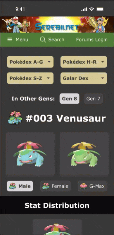
I used the Google Chrome browser extension, "Colour Contrast Checker" to check the color contrast of Serebii’s homepage and two other pages: a Pokedex Landing page and Venusaur’s Dex page.
All of the green UI site elements fail the contrast check. To resolve these color contrast issues, I darkened all of the dark greens and made sure that the all typography use #FFFFFF to stay consistent with the paragraph text that’s used all throughout the site.
In the survey, respondents noted that all of the typography in Serebii is really small, especially on mobile devices. I then copied Smogon’s font sizing system and applied it to the Serebii redesign, since both sites use Verdana in their font systems.


The Solution: Part 2
Streamlining the Serebii Search Function
An overwhelmingly amount of PokeFans hated how the Search feature would open up a new tab every time they search for a topic.
To resolve this issue, the Search bar now instantly displays search results underneath the search bar after 3 characters are typed in. PokeFans can then see their search results without being redirected to a new browser tab.


The Solution: Part 3
Updating Site UI with Modern Web UI Elements
I incorporated some of the PokeFans’ suggestions from the survey into the Serebii mobile site redesign. These included:
Filter chips on homepage that filter/sort based on individual PokeFans’ interested topics
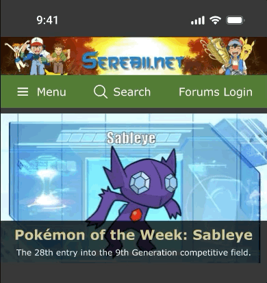
Image carousel that displays Pokemon of the Week, current and upcoming anime episodes
Iconography and charts in Dex pages to make Pokemon info more digestible

The Final Prototype

Positive Outcomes
✅ 100% User Task Success Rate of new Serebii Search
✅ Navigation sidebar and Serebii Search Bar are now WCAG 2.2 AA Compliant
✅ 80% User Satisfaction Rate among testers in final round of Usability Testing
✅ More consistent and cleaner visual standardization of mobile site UI
✅ More easily readable text content