Updating The Local Pages Branding
PRINT DESIGN | PRODUCTION | BRANDING | SMALL FORMAT PRINT DESIGN | PRINT MARKETING DESIGN | POWERPOINT DECK DESIGN | WEBSITE DESIGN
An advertisement agency based in SLC that provides print advertisement solutions to local businesses. The Local Pages (TLP for short) is in the process of rebranding from a phonebook publisher to a travel guide publisher.
Around July of 2019, I updated the Branding Guide and Print Marketing Collateral based on Executives’ input to reflect on this change.
Note: All design work featured in this case study is done through The Local Pages LLC.
The Challenge
Outdated Branding & Marketing Collateral
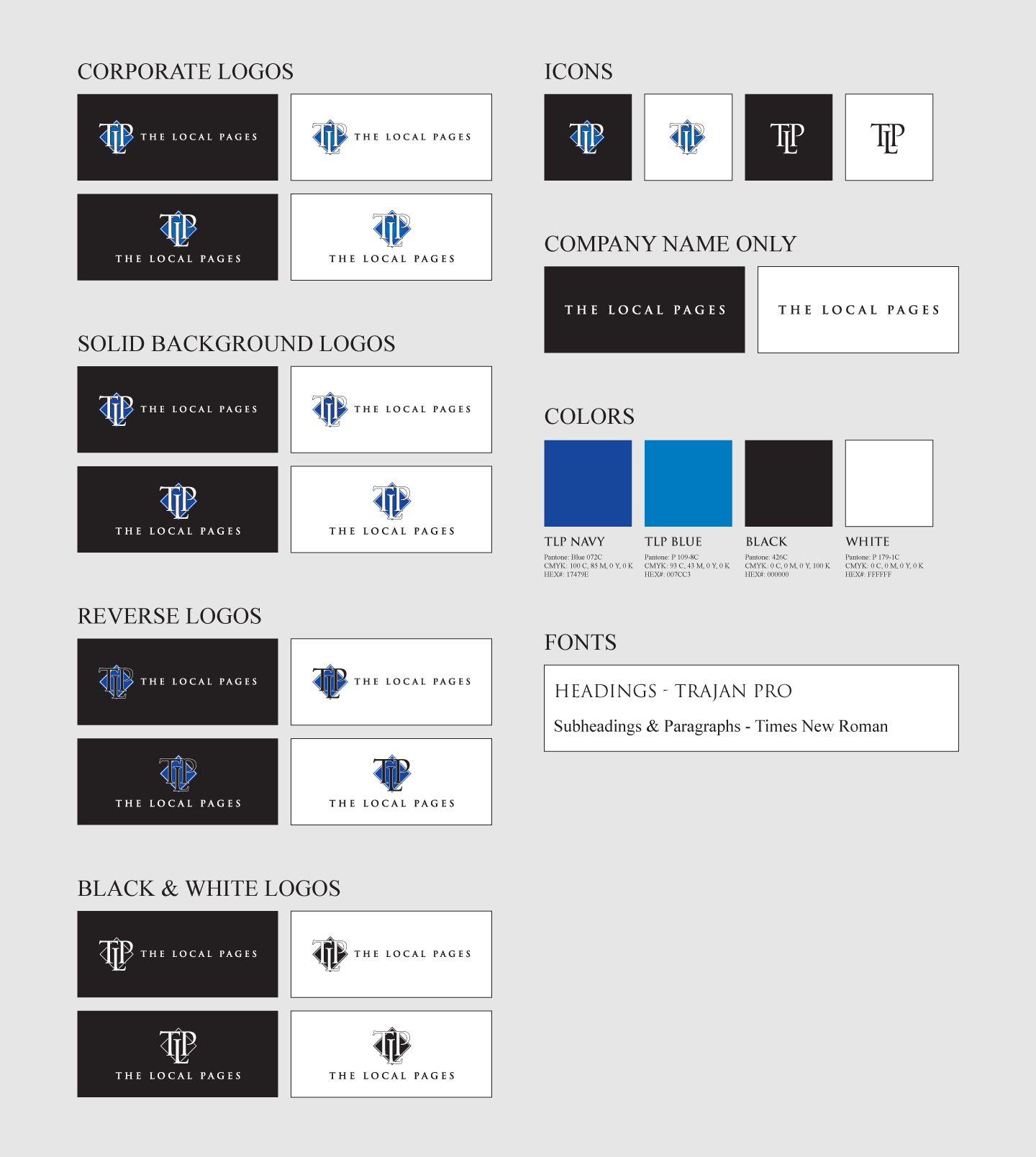
TLP's old Branding Guide utilizes the old logo that has the old tagline of "The Best Phonebook in Town". As of 2019, the agency has decided to rebrand itself to be more of a business & travel guide directory.
Due to this change, I've gone into the old Branding Guide and adjusted all of the logos to not include the old tagline. My Production Manager suggested that the TLP to not have any taglines, just in case if the President decides to rebrand TLP again.


The Solution: Part 1
Updated Branding Guide
Besides updating the logos, I also reorganized the old Branding Guide. My updated version had stronger visual hierarchy. All sections are easily identifiable due to the enlargement of section titles.
I've also added sections that included icons, wordmarks, colors and typography of the TLP brand. This is so that these same guidelines can be applied for digital media.
The Result? More Standard Visualization
With an updated Branding Guide, TLP is now perceived as an agency that publishes travel guides. The agency still has kept their professional and formal look to its Branding Guide with the use of serif fonts.
The updated Guide also allows for more standard visualization amongst all TLP Marketing Collateral, including the Presentation Slides for the weekly staff meetings.
The Solution: Part 2
Updated Sales & Marketing Collateral
With the logo being adjusted to reflect the new direction of TLP, this led to all of the Sales Marketing Collateral in need of updating. The President also noted that the Sales Marketing items should have more emphasis on TLP's Navy Blue or TLP Blue primary colors. This is to match the blue covers on our phonebooks and business/travel guides.
I then updated the business cards and sales sheets of TLP. Luckily, all I needed to do was update the fonts and add more of the TLP Navy Blue and TLP Blue to the collateral.
The Result? A Happy Sales Director
My design updates to the Marketing Collateral led to an increase of overall satisfaction amongst the Sales team.
One day, the Director of Sales stopped by the Production/Graphics department to compliment me on my design updates to the TLP business cards.

![[NEW] TLP Business Card - Mark Hood (1).png](https://images.squarespace-cdn.com/content/v1/67cc9e12cd1b8029b56b628c/a91b1514-195c-477f-99e5-ce19207f578d/%5BNEW%5D+TLP+Business+Card+-+Mark+Hood+%281%29.png)


