Simplifying the Open Road App to Regain Trust from Users
UX DESIGN | UI DESIGN | UX RESEARCH | USABILITY TESTING | ACCESSIBILITY DESIGN | WCAG 2.2
The Open Road App is a hybrid business directory/travel guide for travelers adventuring through Alaska and the Alaska Highway. It features scenic detours, must-see landmarks, local businesses and alternate routes along these areas.
I created my app design solutions using Figma and used my iPhone 13 to download the Open Road App for the Usability Testing sessions.
Note: All design work featured in this case study is done through Open Road Publishing.
The Challenge
Get Feedback on App and Offer Design Solution Within 3 Days
On May 2025, the Open Road App was released to the Google Play and App Stores. Unfortunately, the Executives and Directors were not happy with how the app turned out.
The app was full of placeholder content: tons of blank images with the phrase “Under Construction”, image descriptions are in lorem ipsum placeholder text, the written language in the app is confusing…the list goes on and on.
After the Executives had their meeting, the Director of Marketing tasked the Production team to gather feedback on the app. As the only Designer at the time, I was then tasked to offer some design solutions to some of the app issues. The design solutions will then be passed along to the App Developers over in India who’ll then iterate the app based on my design solutions.
Encountering a Major Roadblock
The Open Road App Has Completely Changed…
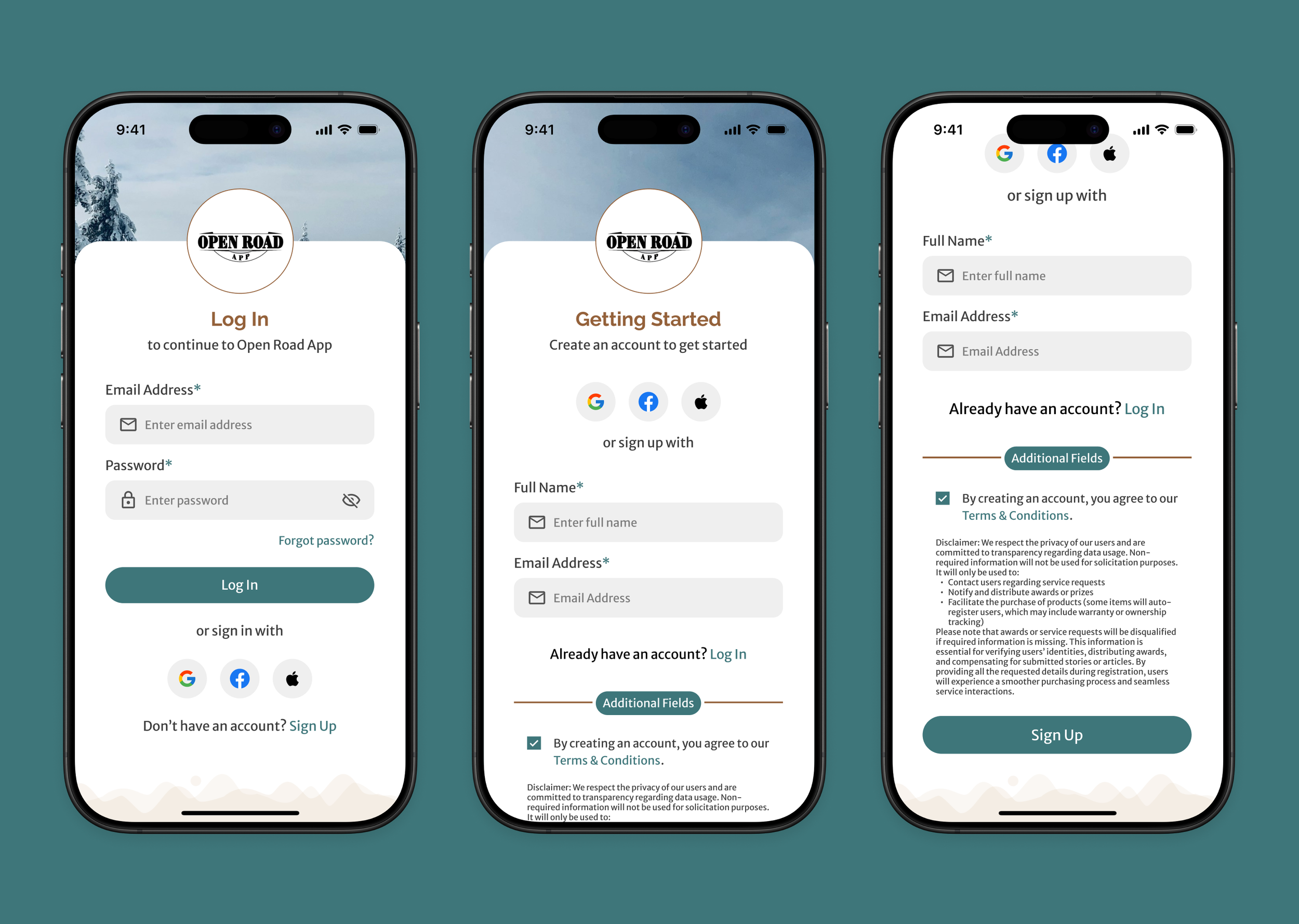
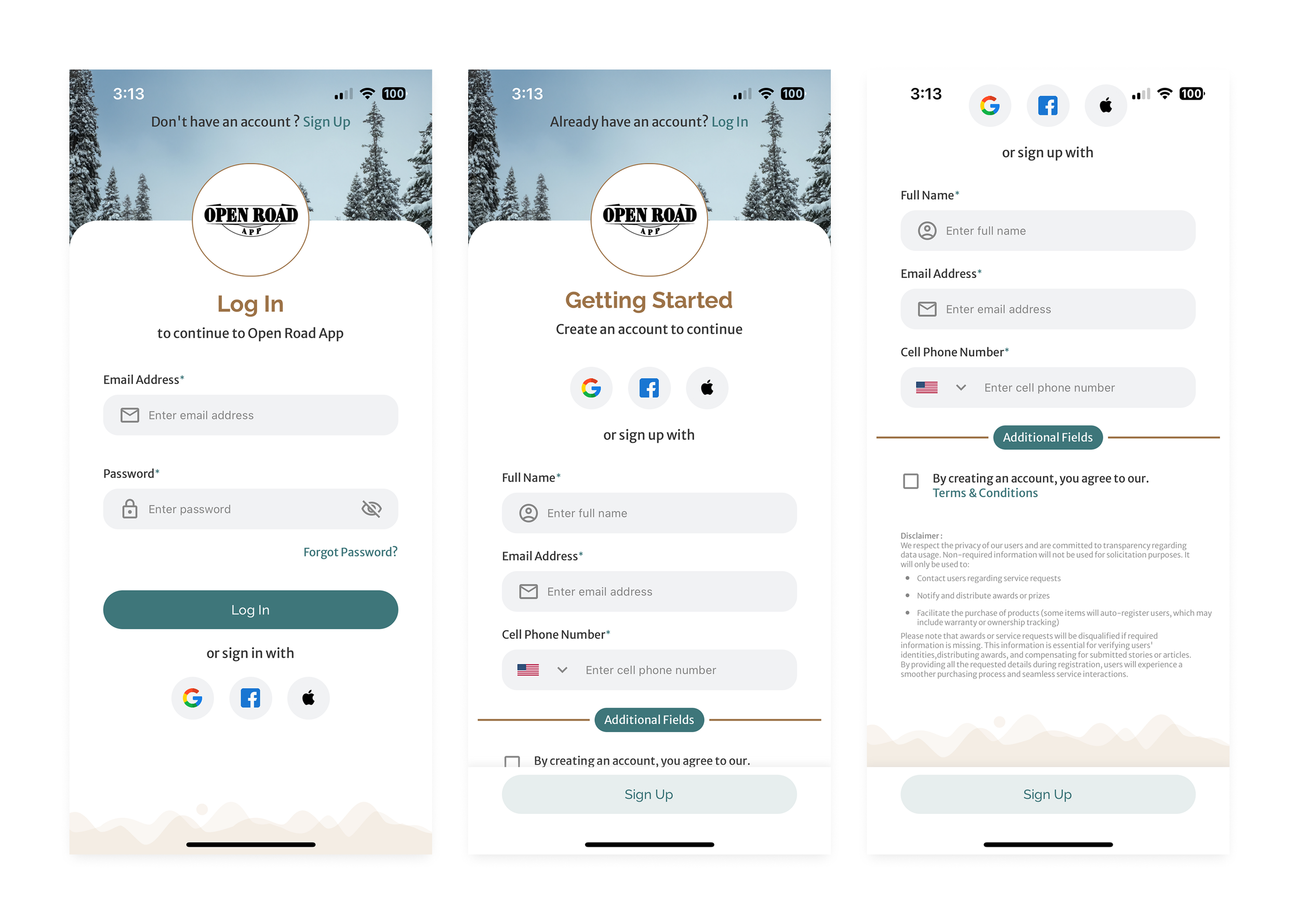
The Production team then started to download the App to their phones. We then noticed that the startup screen looked nothing like what the Director of Marketing described to us. It was then that the team realized that the App Developers have scrapped the app and locked all users behind a Login screen. This prevented anyone from proceeding past the Login/Create a New Account screen.
So…the Production team has no choice but to gather feedback on the App’s Login and Create a New Account screens, because there’s nothing else in the app at the time.
Conducting Research
Gathering Feedback from Seasoned Travelers
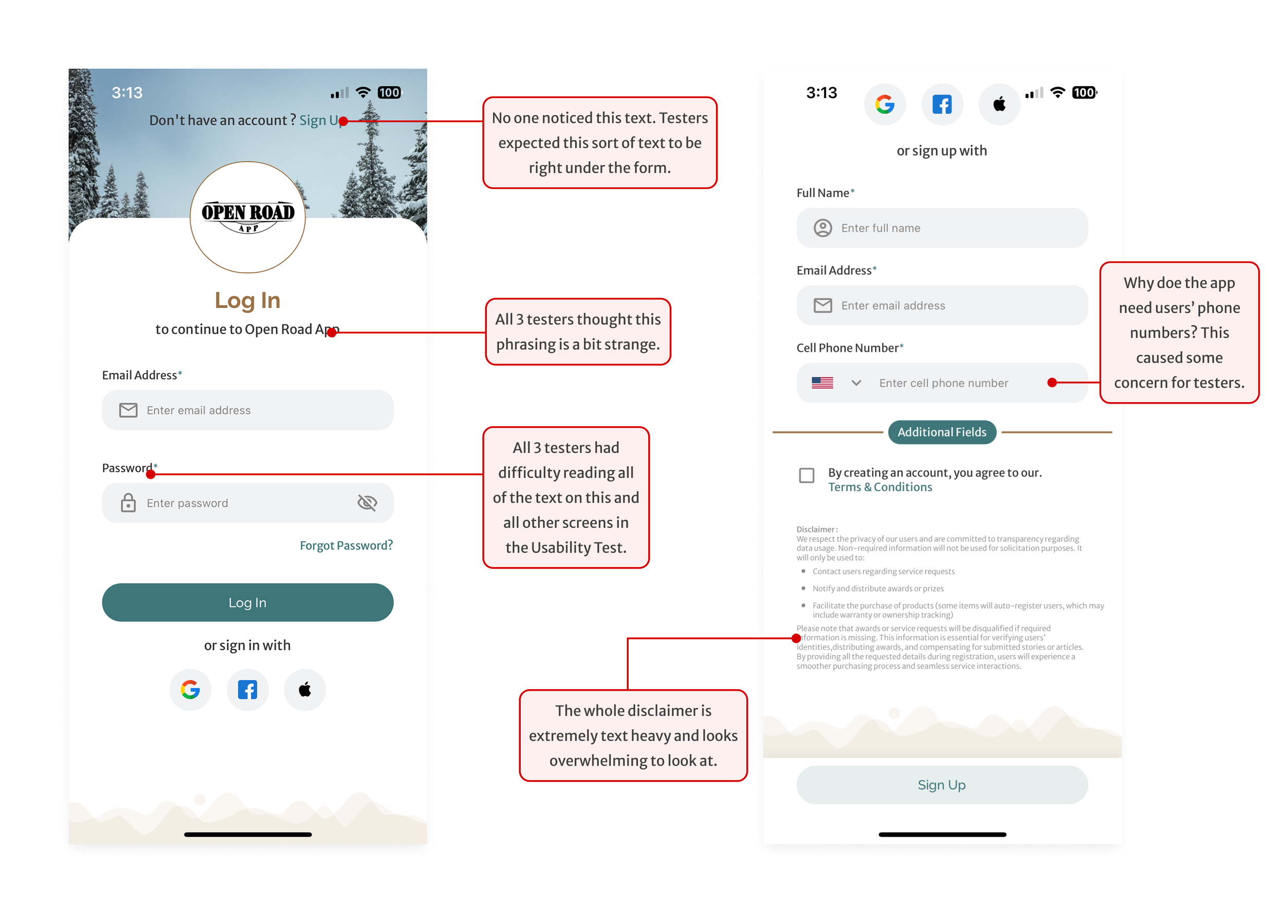
I started the UX Research process by conducting Usability Tests on 3 seasoned travelers who are based in Utah. All three test subjects were tasked to create a new account in the Open Road App. Here are some of their thoughts throughout each test.

The Problems to Fix
Based on the Usability Testing results, my design solution need to address these issues:
Text phrasing: some of the phrasing and/or abbreviations are confusing to app users. My solution needs to clear up the phrasing.
Font Sizing: all testers have some sort of vision impairment and noted that all of the typography is difficult to read. I’ll need to set the base paragraph font sizing to be the standard 16pt.
Trust: this partly ties into point #1. With the strange and confusing phrasing, along with the app requiring users’ cellphone numbers, this causes users and customers to lose trust in Open Road Publishing and the Open Road App. If this doesn’t get resolved, this can result in a decrease of sales towards Open Road Publishing.
The Solution
The New Login & Create New Account Screens
In the new iteration of the Open Road App, the base typography size follows the standard 16pt font for webapp and apps. All disclaimers will be treated as a footnote and thus, will have a font size of 10pt.
After discussion with the Director of Marketing about the error messages, she recommended to just get rid of all of the confusing error messages altogether due to the short time we have with this project.
The Outcome? Radio Silence.
After I sent the design solutions to the Director of Marketing, I haven’t received any communication from the App Development team or any of the Directors. The Production team instead were assigned a few new projects, which caused the team to shift priorities.