Local State National Connections Logos
From March 2025 to April 2025, I was tasked to conceptualize some logos for an upcoming business guide. This new product aims to be another magazine that has information and advertisement for local businesses for each of the 50 states in the US.
I only used Adobe Illustrator to create each batch of logo concepts.
Note: All design work featured in this case study is done through Open Road Publishing.
The Challenge
A New Product for Open Road Publishing
After the success of the 3rd edition of the Open Road Guide, the CEO of Open Road Publishing decided on creating another travel guide magazine that focused on the continental US states. I was tasked by the Director of Marketing to create the logos for the new travel guide magazine: Statewide Connections.
The Director of Marketing messaged me requesting that I come up with some logo concepts for our new internal brand product "Statewide Connections", a magazine guide that contains contract info and advertising for any given state. In a nutshell, the logo needs an outline of the lower US 48 states (excluding AK/HI) and the product name "Statewide Connections".
Round 1 of Concepts
Statewide or LSN Connections?
A day after submitting the concepts to her, the President wanted to change the name of the product. He insisted that Statewide be replaced with LSN, which stood for Local State National. Before I could submit the concepts with the new name, the President chimed in again requesting to do away with the concepts with the blue US shape. He noted that the blue shape took too much attention away from the product name.
And so, I just expanded on the grey US silhouette and outline concepts, while exploring different typography combinations.


The Result?
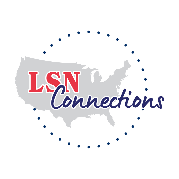
The Directors decided on two logo concepts. However, the President was not a fan of the circle of dots surrounding the main logo. So, I had to move forward to another round of logo concepts that expand on the chosen concept.
Round 2 of Concepts
More Color Choices & No Dots
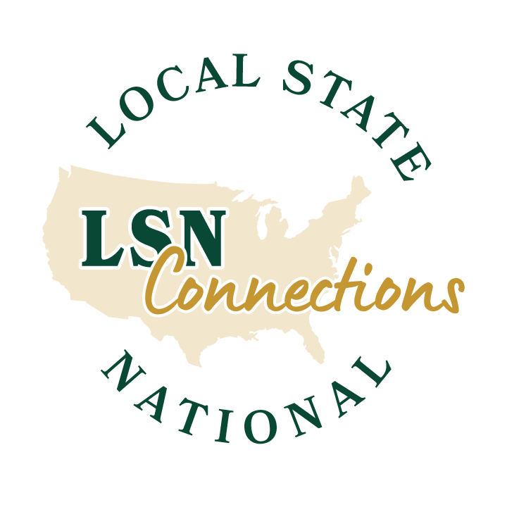
A week later, the Directors and President came to a consensus on two logo concepts. However, they wanted to see another round of concepts where the dots are replaced with words. They wanted Local State to be placed along the top half of the circle, while National is placed along the bottom. In addition, they wanted me to further explore on additional color combinations.
The President then requested another group of concepts that include the following:
• Simple silhouette/outline of the US
• LSN letters off to the right in fancy font
• Connections underneath in normal font
• Local State National under the silhouette
• Variety of color combinations

The Result?
Majority of the Directors liked one of the concepts, but would like to see more variants that played around with the placement/layout of the text around the main logo image. Onto another round of logo concepts it is then!
Round 3 of Concepts
Adding a Silhouette of a US State
The President then decided that the concepts should have a silhouette of an individual US state, as there are plans for having different magazines for each of the 50 US states.
In addition, the President and Directors suggested the following:
• Replacing "Local State" with “Local • Statewide”
• Reducing the size of "Local • Statewide • National”
• Playing around with placement of “Local • Statewide • National”


The Result?
The Executive team decided on two logo concepts. However, they weren’t fans of “Local • Statewide • National” being in a curve/arc. The President also wanted there to be two different versions of the main logo: one version where states that are located on the western US region should have their silhouettes placed to the left of LSN; while the eastern US states should be placed to the right of LSN. Another round of logo concepts I go then!
Round 4 of Concepts
No More Arched Text
This round of concepts mainly consisted of the following suggestions from the Directors:
• Changing the bullet points to hyphens
• Straightening out the list, so that it’s not in an arc/curve
• Having the list on one line and on two lines
• Having silhouettes of western US states be to the left of LSN
• Having silhouettes of eastern US states be to the right of LSN


The Result?
All of the Directors in the Executive team came to the unanimous consensus in two logo concepts, but with very minor tweaks. In the finalized versions of these last two concepts, each state silhouette should have the state abbreviation in the same color as “Connections”.
As noted before, there will be different LSN Connections logos for each US state (except for HI and AK). States located in the western US will use the LSN Connections logo with the company name right aligned. Otherwise, states in the east will use the logo with the company name left aligned.
The Solution in its Final Form
The Polished Primary Logos
The primary logo is the main logo to use for all marketing collateral. This version of the LSN Connections logo doesn’t have any US state silhouettes and has the company name right aligned per request of the Executives. A black version and a white version of the primary logo is created as well.


The Solution in its Final Form (Part 2)
The Polished Secondary Logos
The secondary logos are to only be used on the LSN Connections magazine covers or marketing collateral that are specific to a US state.


