The Alaska & Alaska Highway Travel & Business Guide (AHM) Branding
BRANDING | PRODUCTION | LAYOUT DESIGN | SMALL FORMAT PRINT DESIGN | PRESENTATION DECK DESIGN | WEBSITE DESIGN
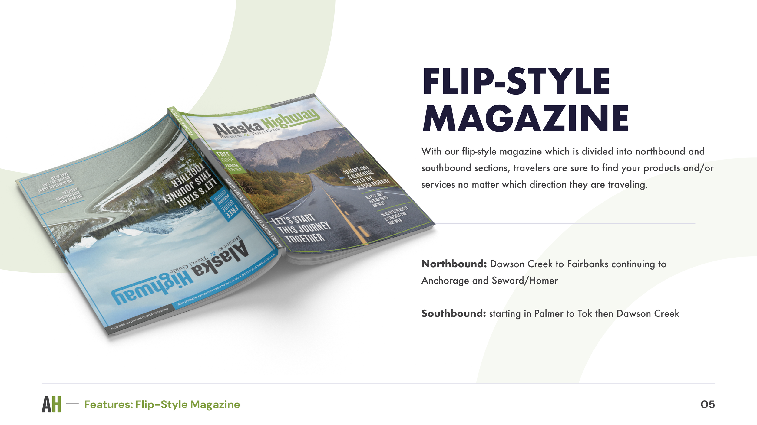
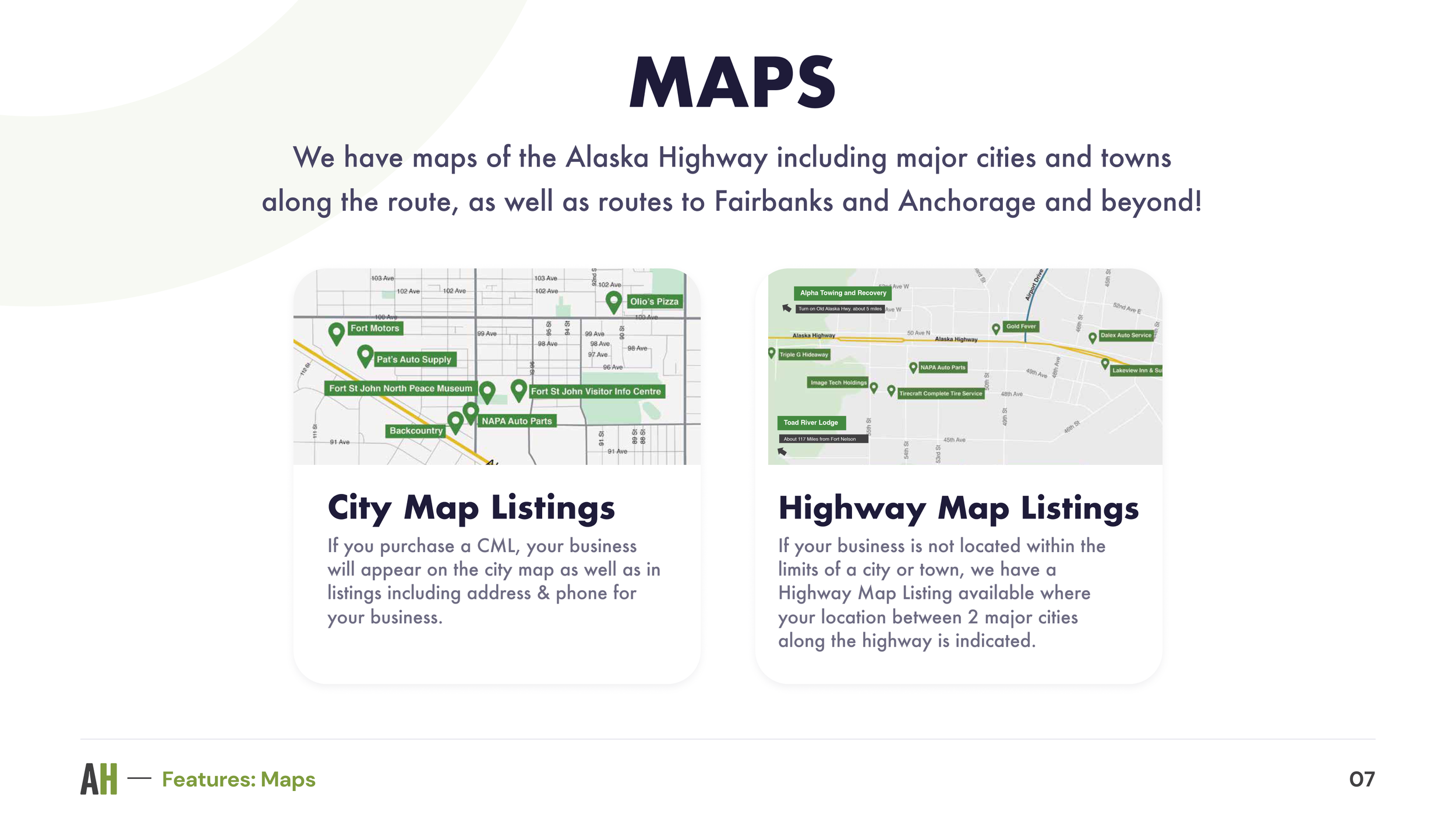
An annual travel guide magazine that provides travelers information about the many local businesses along the Alaska Highway.
With the help of the Art Director, I updated the Branding Guide and created the web assets to be used for the new website. I also upgraded the original site with features that aim to entice more new advertisers to advertise with the publication.
Note: All design work featured in this case study is done through Open Road Publishing.

The Challenge
Disorganized Branding
The old Branding Guide didn’t account for the AHM logo being used on darker backgrounds. This lead to too many different versions of the AHM logo in all of the marketing pieces due to all of the designers changing the logo to colors that didn’t follow the Branding Guide.
Despite the old Branding Guide listing the typographic styling for all AHM marketing collateral, none of us designers were utilizing the correct fonts when creating such marketing pieces. This also led to a lack of visual standardization amongst all AHM marketing collateral being created by three different designers.
The President of AHM noted how the past couple magazine issues have been disorganized. He believed that with a more organized Branding Guide, the magazine will then be more organized too.


The Solution: Part 1
A Cleaner Branding Guide
I then started tackling the Branding Guide by first condensing the file into one Illustrator artboard. The President of AHM emphasized that the magazine itself should be user-friendly to our customers who read the magazine. With this in mind, I simply just kept the Branding Guide clean and simple.
The Result? A More Organized Brand
With a cleaner Branding Guide, now the AHM brand will be perceived as a more organized, professional, yet more modern, and fun magazine brand. In turn, the AHM President noted on how the updated Branding Guide looks more user-friendly and easily digestible.
With the President's approval of the updated Branding Guide, I applied the new styling to the AHM Media Kit. This Media Kit is then converted to a PowerPoint presentation file that the Sales Representatives can use when out in the field.


The Solution: Part 2
Updated Marketing Collateral
I then updated the business cards and sales sheets of the AHM. Luckily, all I needed to do was update the fonts and add more color to the collateral.
The original business card design was a single-sided design. My updated design is flexible in that the President and/or Sales Representatives can choose whether to have their business cards printed single-sided or double-sided. The single-sided design can be used if the AHM is on a tighter printing budget.
The Result? Marketing Collateral that Pop
My design updates to the Marketing Collateral led to an increase of overall satisfaction amongst the Sales team.
One of the Representatives approached me to compliment on how the business cards now "pop with color". She also noted how the updated business cards led to more customers actually replying back to her emails quicker.